EXIT
Reposition and overhaul a platftorm for experts
who predict the future of the economy.
Predicting the future of the economy.
EXIT is an economy research firm specialized in business cycles. (how the economy behaves) They’re so good at analyzing these cycles, they’re able to predict areas and regions where you should invest, or be careful of investing.
They came to us hoping to reposition themselves as a premium firm, be perceived as business partners instead of data vendors, and to help them re-think how all the amazing work they do can be delivered to their clients.
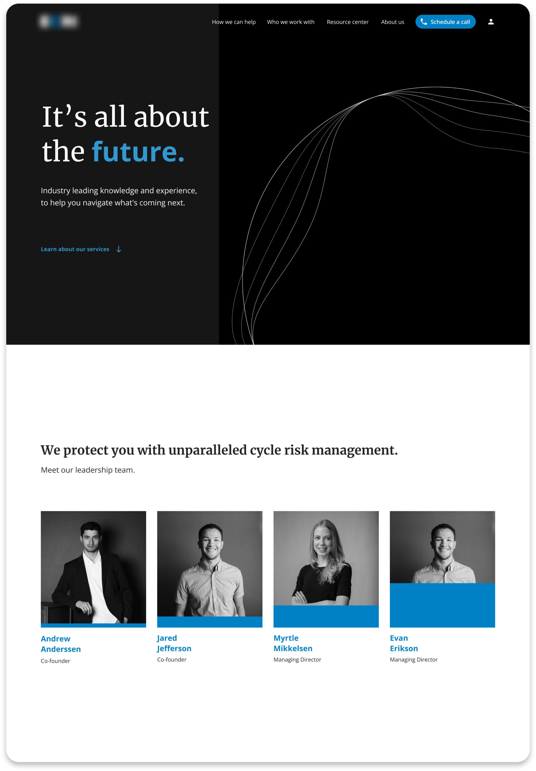
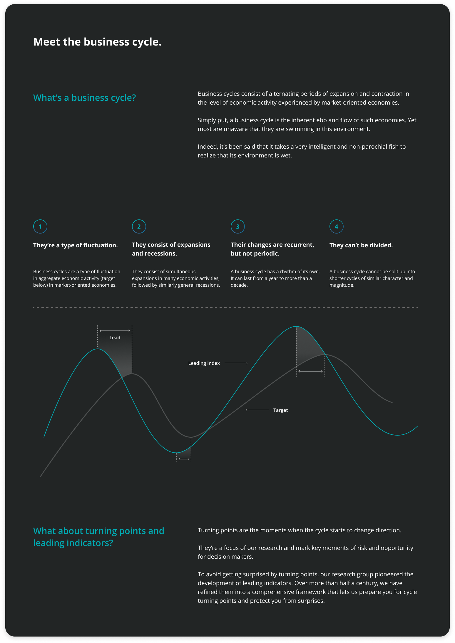
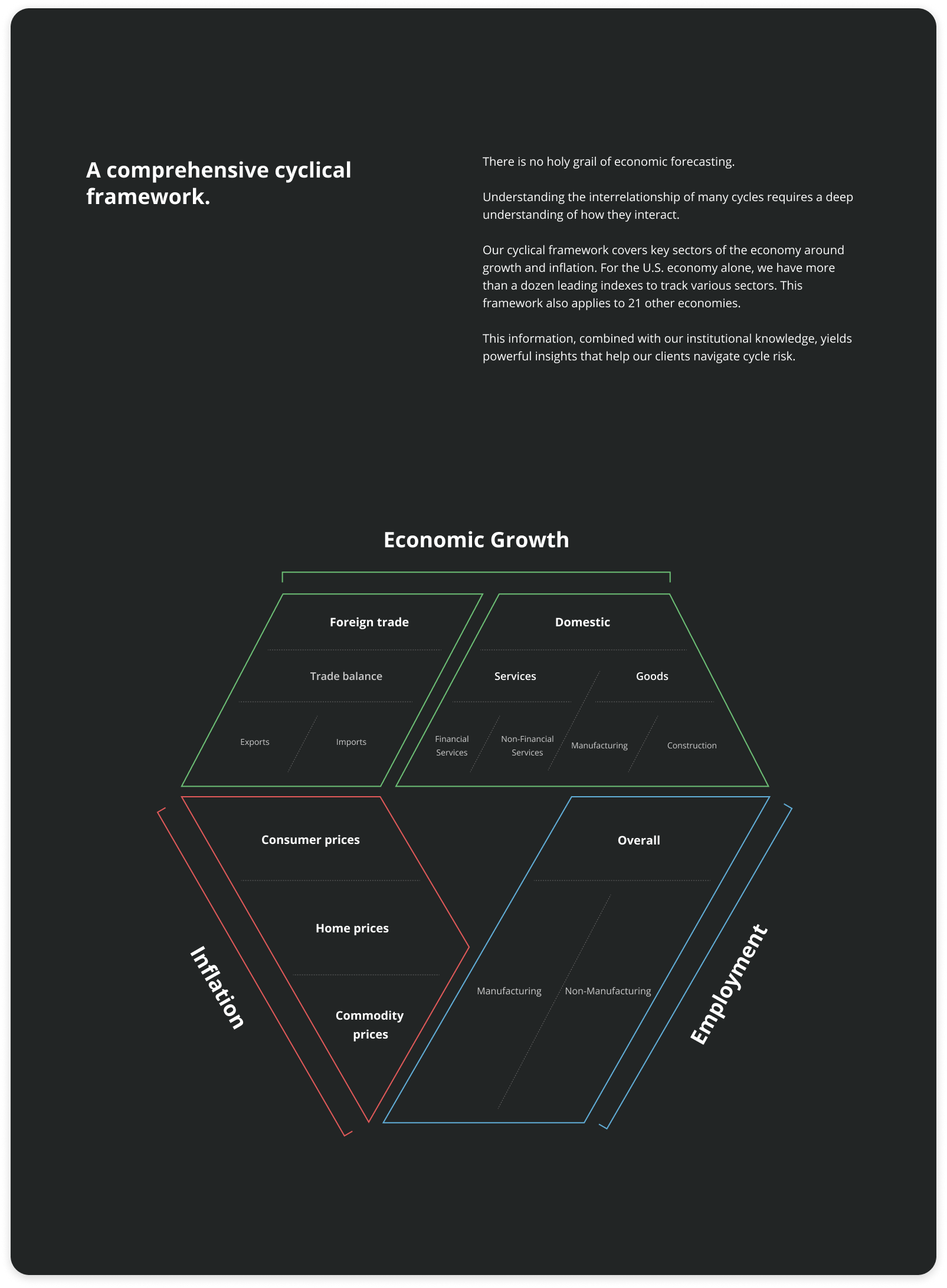
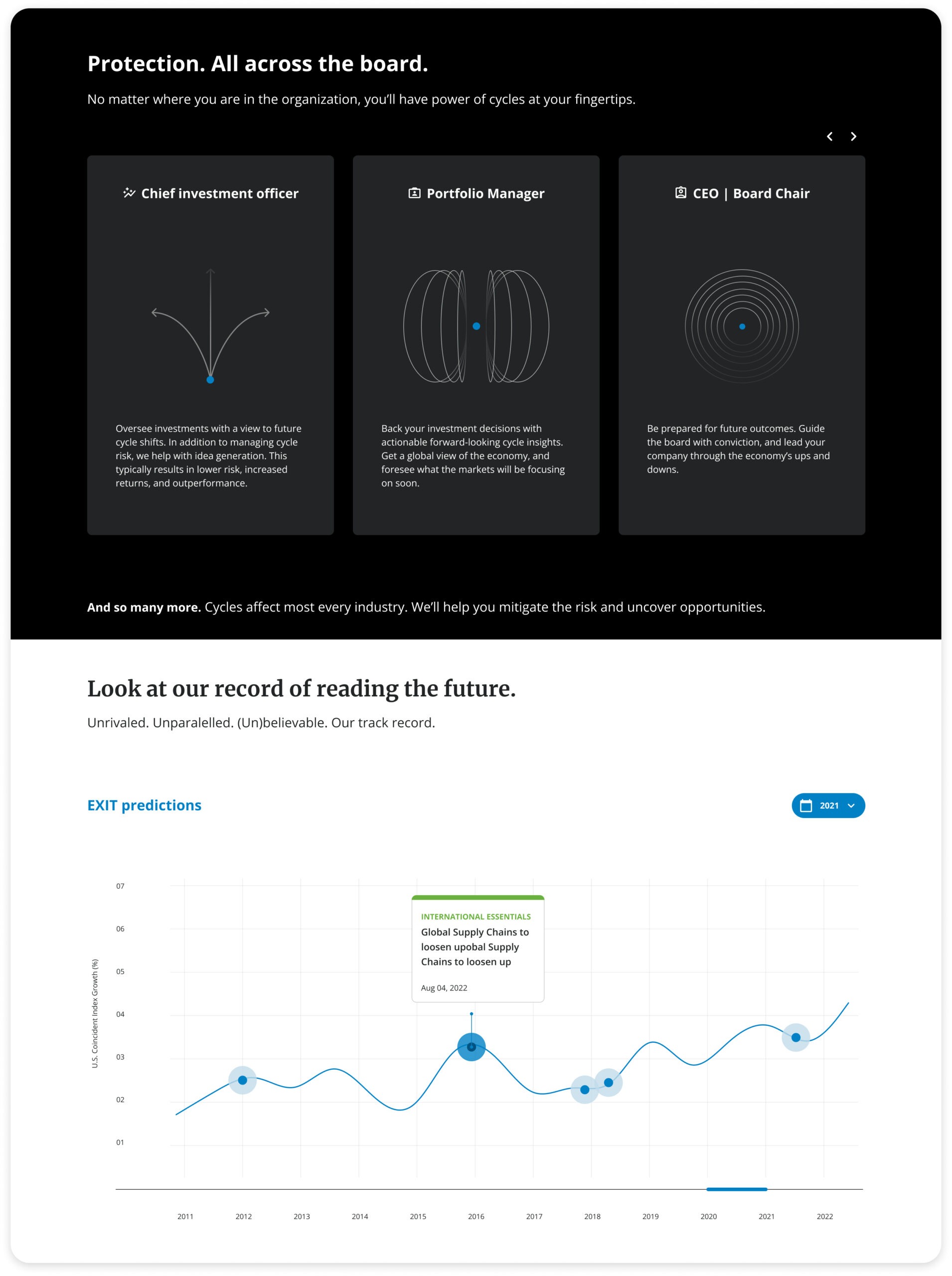
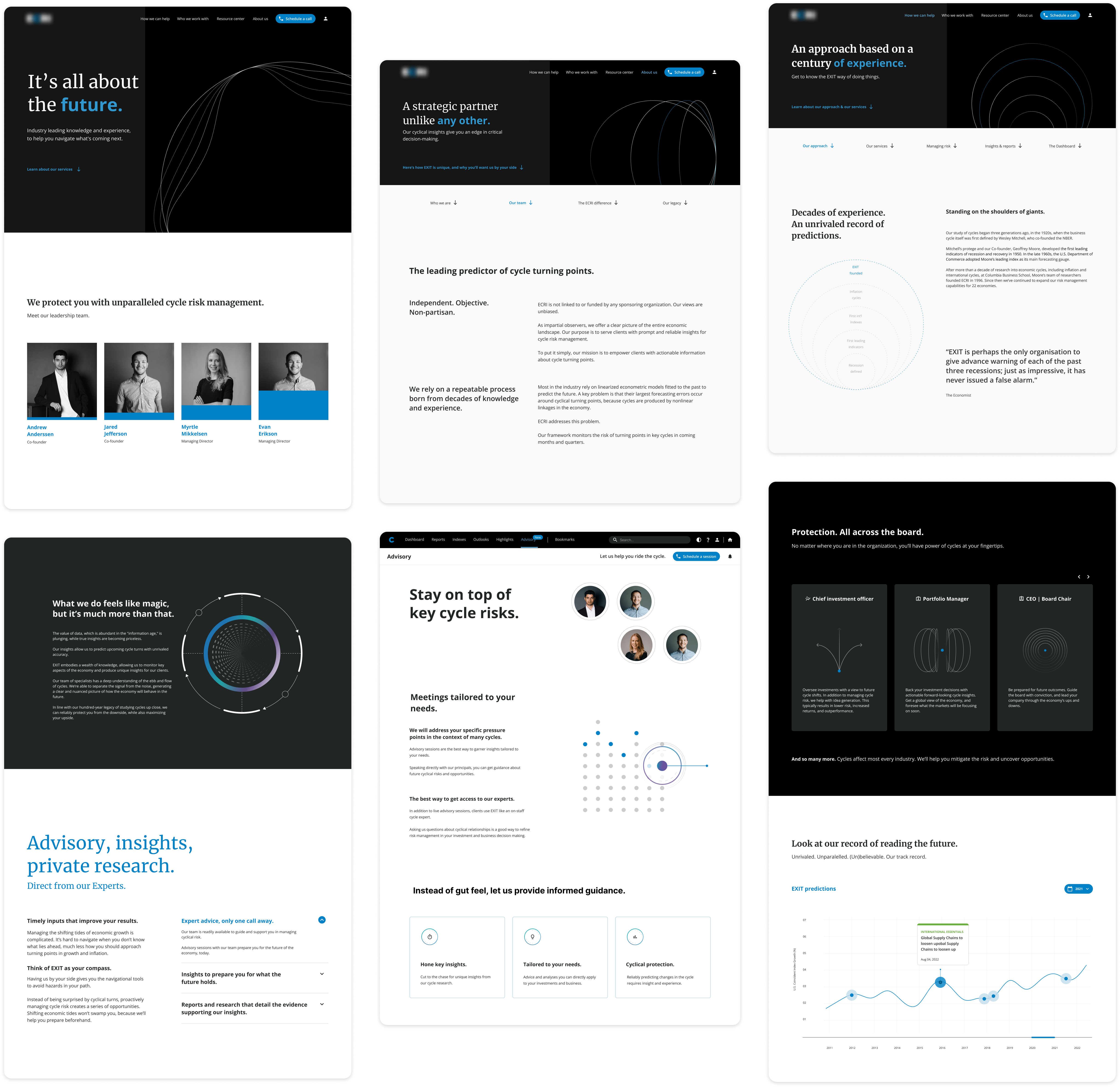
We designed a storytelling-driven homepage, where we let their work speak for itself, an amazing customizable dashboard, so their clients can personalize the way in which the data they need is displayed, and we wrote copy to help enhance this new image they wanted to portray.
The client told us they made a <100% ROI in less than 8 months since the launch of the redesign, and the project was a runner up for 2023’s Launch Experience of the Year award.
6 months
Time spent on project
3 challenges
Research what they do, redesign their site and reposition them with copy.
3 Roles
UX Designer, User Researcher, Copywriter.
What do they do?
Great question. Their work is incredibly complex, so we did a looooooot of research, workshops and interviews to a) understand it, and b) translate it into something people could understand.
We figured out their targets were C-suite level folks who could pitch EXIT’s services to their companies, but they had trouble connecting with these users.
With good design and good content strategy, we lowered the barrier-to-entry, allowing even more people to understand and get interested.
Take a look at our research board. (yeah, it wasn’t a joke hahah )


Who’s this for anyway?
After doing interviews, analyzing our clients’ input, and honing in on their need to reposition, we came up with two personas.
What’s really interesting is that despite them preferring decision-makers as clients, they seemed to be attracting data collectors.
Our strategy then focused on adding more value to this type of user, so we could attract them to our client more easily.
Distilling down the insights
After analyzing the content strategy of both big consulting and boutique firms, performing a few workshops, doing user interviews, rethinking their entire site information architecture, and about a hundred more research-related tasks, we discovered four constant themes for EXIT.
1-. They need to feel trustworthy. Their clients make +million dollar moves based on their recommendations, they cannot afford to act on faulty/flawed information.
2-. They have to look premium. Not only do their clients make 6+ figure investments based on EXIT’s calls, but also their service is boutique and bespoke. They walk the walk, and need to look the part.
3-. They are Leaders in this space. The discovery of business cycles, and all the science they have come up with to analyze them since then, can be attributed to EXIT. They are an authority in the economy world, and experts look up to what they have to say.
4-. Their work is all about the future. They are able to predict how the economy will behave, with unrivaled accuracy. We should represent this dimension in their image too.
Let’s get down to business
Now it’s time for wireframes, testing, menu structure, systems, all the good stuff.
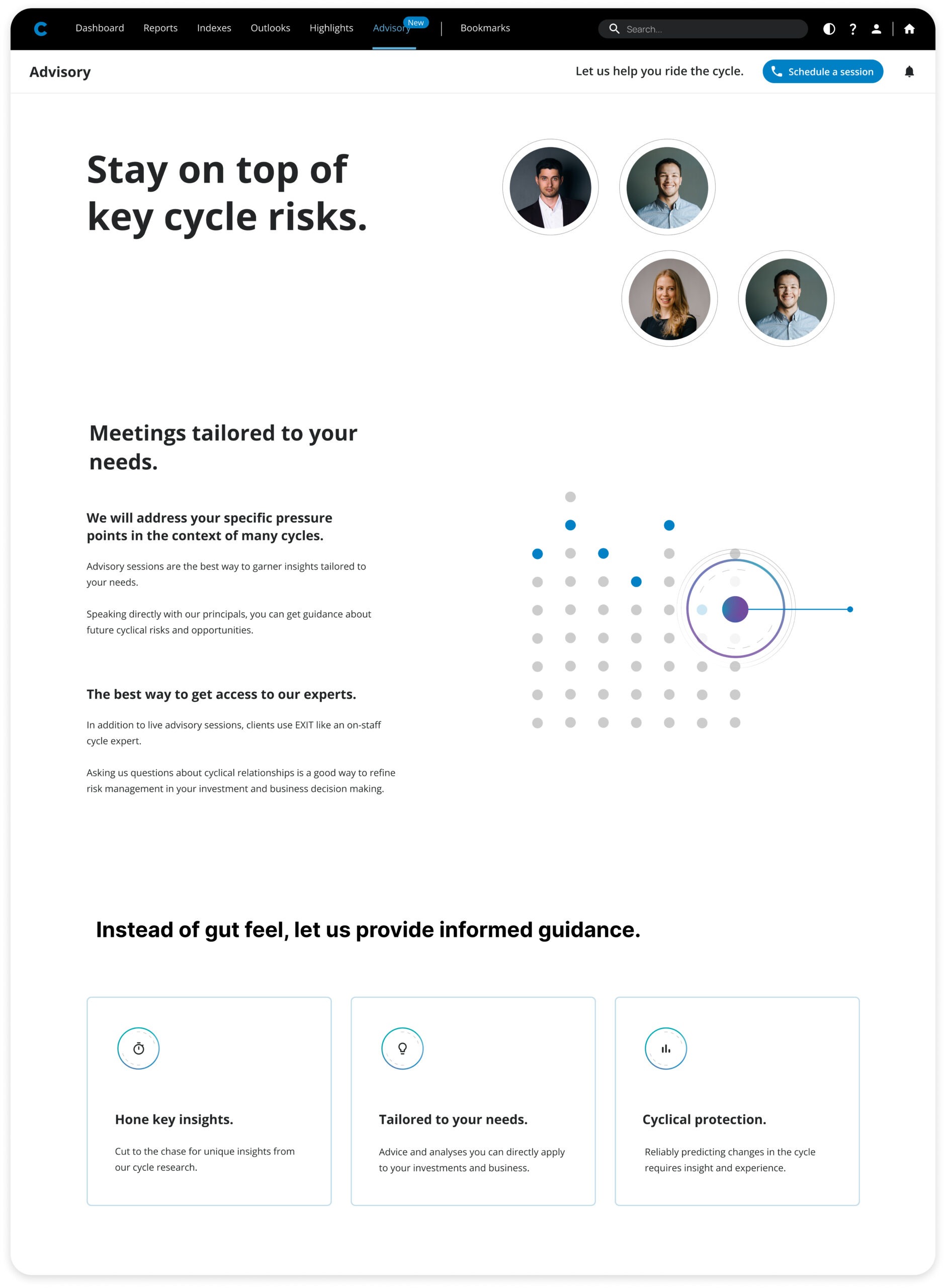
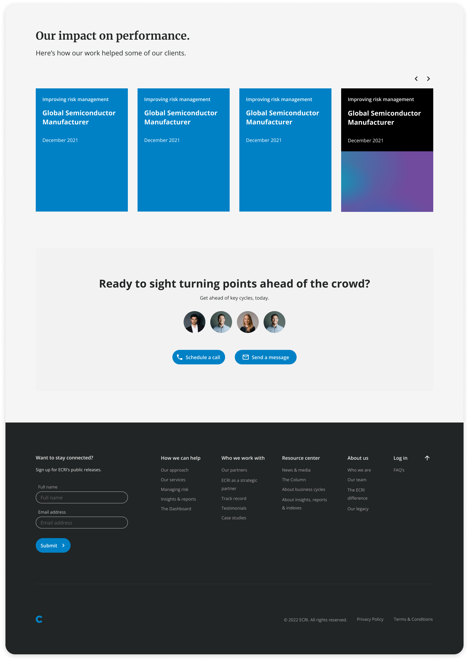
It’s odd, but we kind of designed two different sites that meshed together into one.
This is because the user journey is wildly different between those who are potential clients, versus those who already use EXIT’s services.
We have the Pre-client journey, where we use storytelling and intentional design to always guide the user towards a contact CTA.
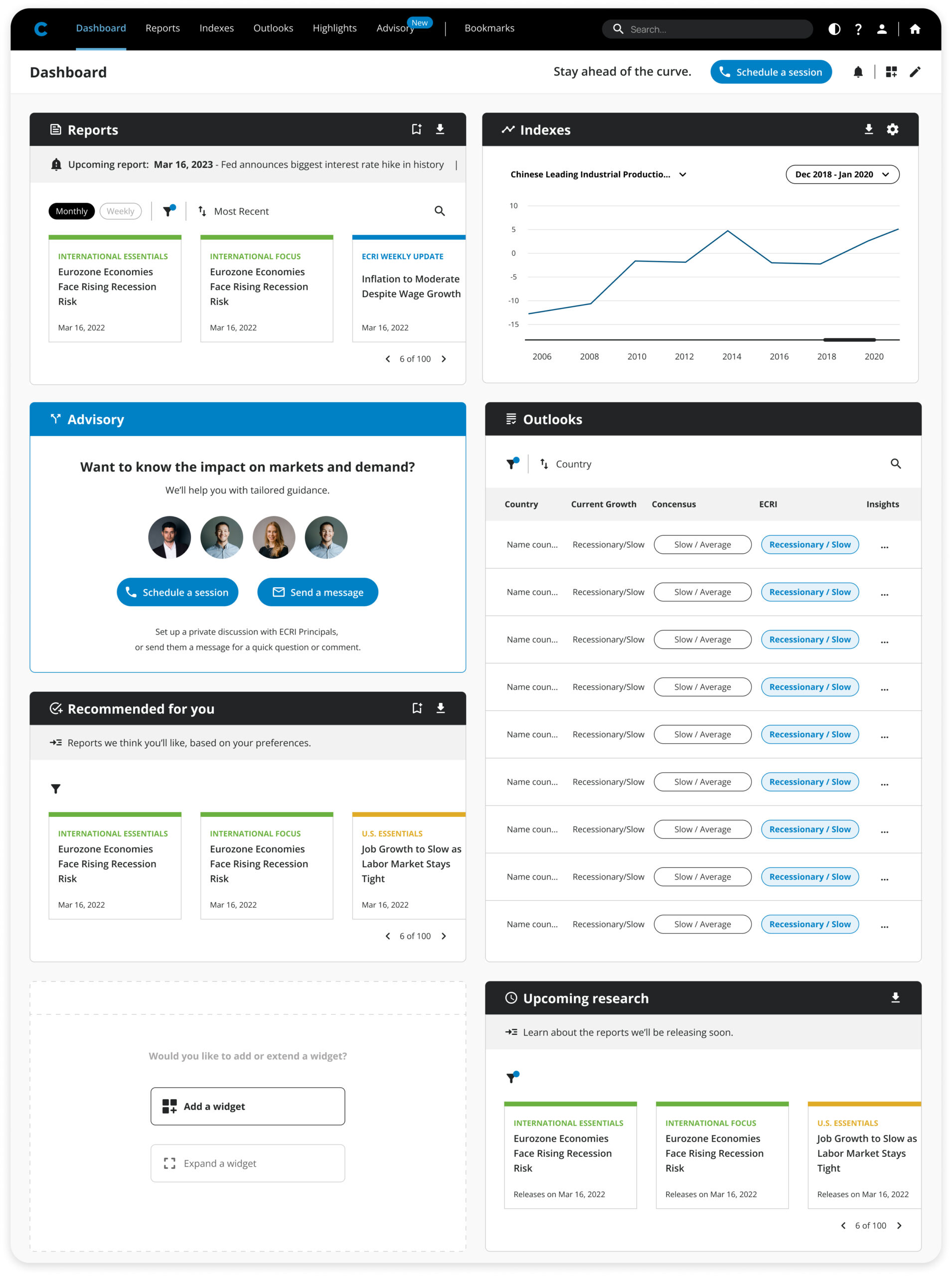
And then, the actual Client site, where they have access to EXIT’s services. The biggest part is a customizable dashboard, where they can move, add and adjust widgets to display the information they need, so the page fits their needs, and we don’t constrain these highly specialized experts in their workflows.
Why the dashboard?
We thought about what they’re users have to do. After doing interviews, talking to our stakeholders, and analyzing all our findings, we couldn’t really decide on *one* best way to lay all this information out. That’s because these users don’t really have the same needs.
Yes, they all need information about business cycles and economy behavior, but they all analyze different markets, datasets, and indexes. So the best course of action was to give them the freedom to choose the things the want to track, and empower their workflows.
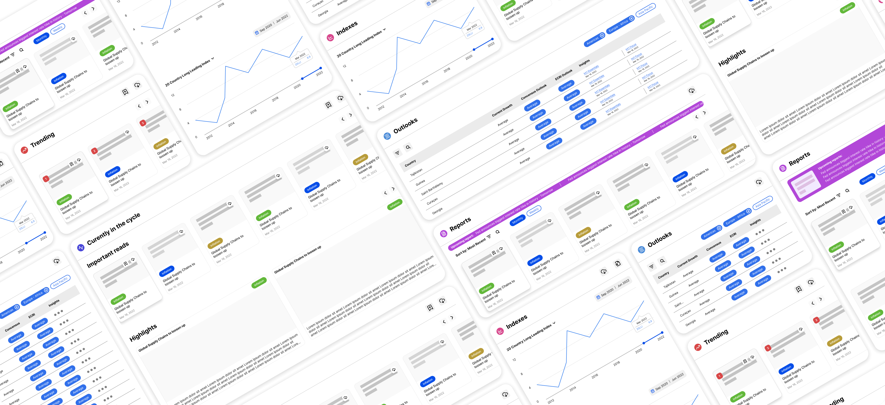
And this is how it looks!
Hope you enjoy it as much as I loved working on it.
Want to get in touch?
RNPDesign.com | My portfolio | All rights reserved. 2024.

