UX/UI | Blink
Imagine a world where teleporting is a thing and competes directly with other transportation methods. Cool, right? but how does it work?
Timeframe
About a week
Challenge
A teleportation service app
Role
Lead product designer
Let’s set some ground rules!
The goal of the challenge was to create a minimum viable product.
Because of the time constraints, the best option was to do a design sprint.
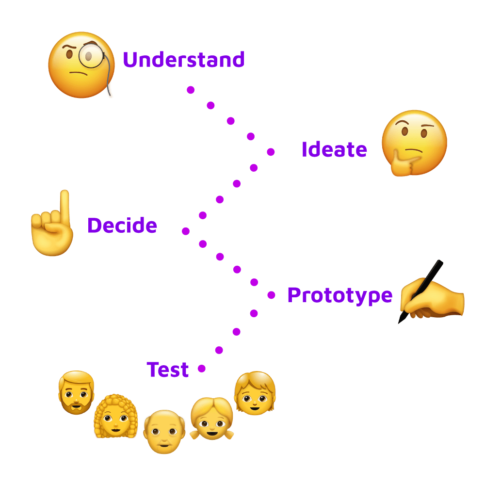
This means following 5 phases: understand the user, ideate solutions to their problems, decide which one best solves their needs, prototype how the solution might look like, and test with potential users.
Because this was a design challenge for a company, I couldn’t work on the test phase, but I can share the work of all the other phases 🤓.
Who’s this for?
Part of the understand phase is to define who’s an end user. There’s tons of people who’d love a teleportation service, but I believe these are the main target for Blink.
Younger people
People with environmental concerns

Workers in densely populated areas
People who use public transportation
People with reduced mobility
People who use ride share apps
![Thinking Emoji [Free Download IOS Emojis]](https://rnpdesign.com/wp-content/uploads/2021/08/Thinking-Emoji-Free-Download-IOS-Emojis.png)
How to solve their needs?
Let’s work on a mix between a rideshare service and the metro network, leveraging on the power of teleportation!
We’d need an app to find the best routes for users, connected to a network of teleporters dispersed throughout the city.
Users could head to the closest porter to their location and teleport to the one closest to their destination.
What about the User Experience?
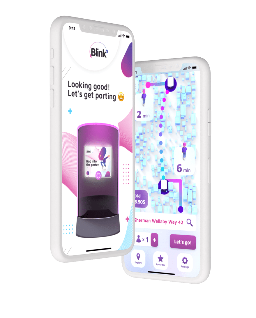
The UX should feel familiar, sort of a mix between a rideshare app and a maps app. Despite Blink being a first-of-its-kind service, users should become familiar with the product intuitively, because it mirrors experiences they already know.
Here’s a short video of the ideal flow!
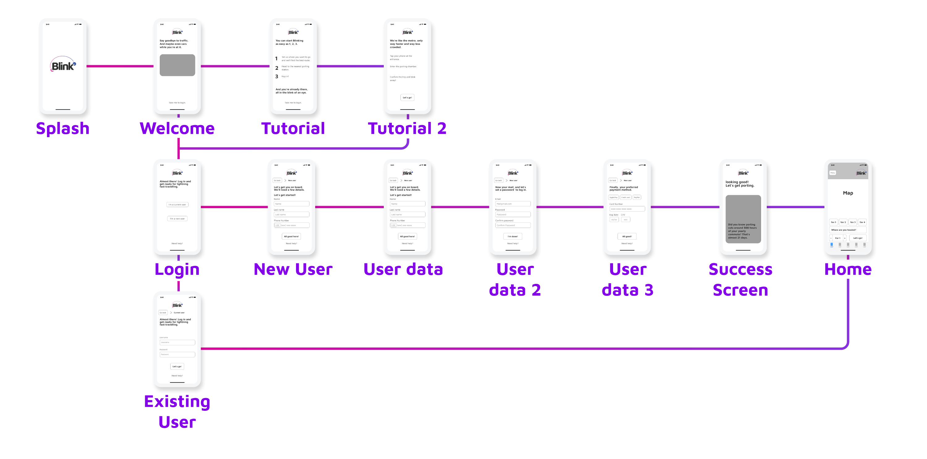
This is the onboarding experience flow 🤯
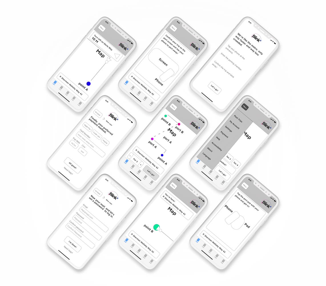
And this is the travel experience flow 🗺️

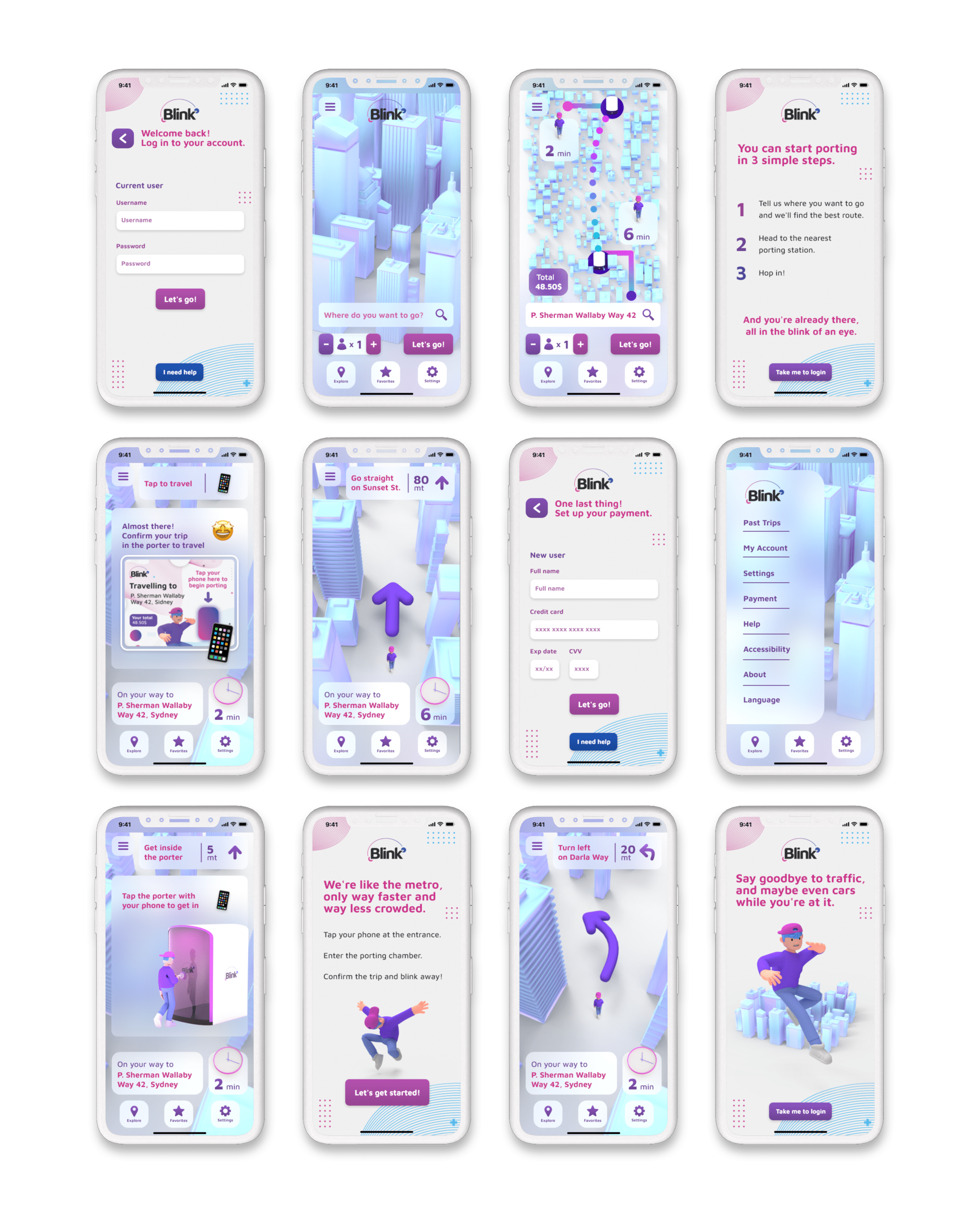
Now, let’s talk UI!

Why the aesthetic?
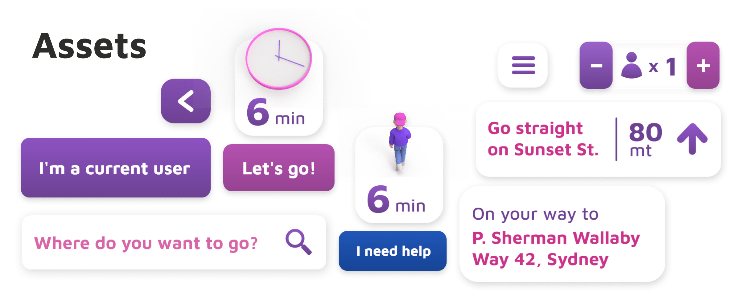
Because this is such a futuristic product, the design has to convey that feeling as well. The interface has to feel modern and fun, as well as have a certain visual appeal.
All this must come together in a way that users will still know how to navigate.
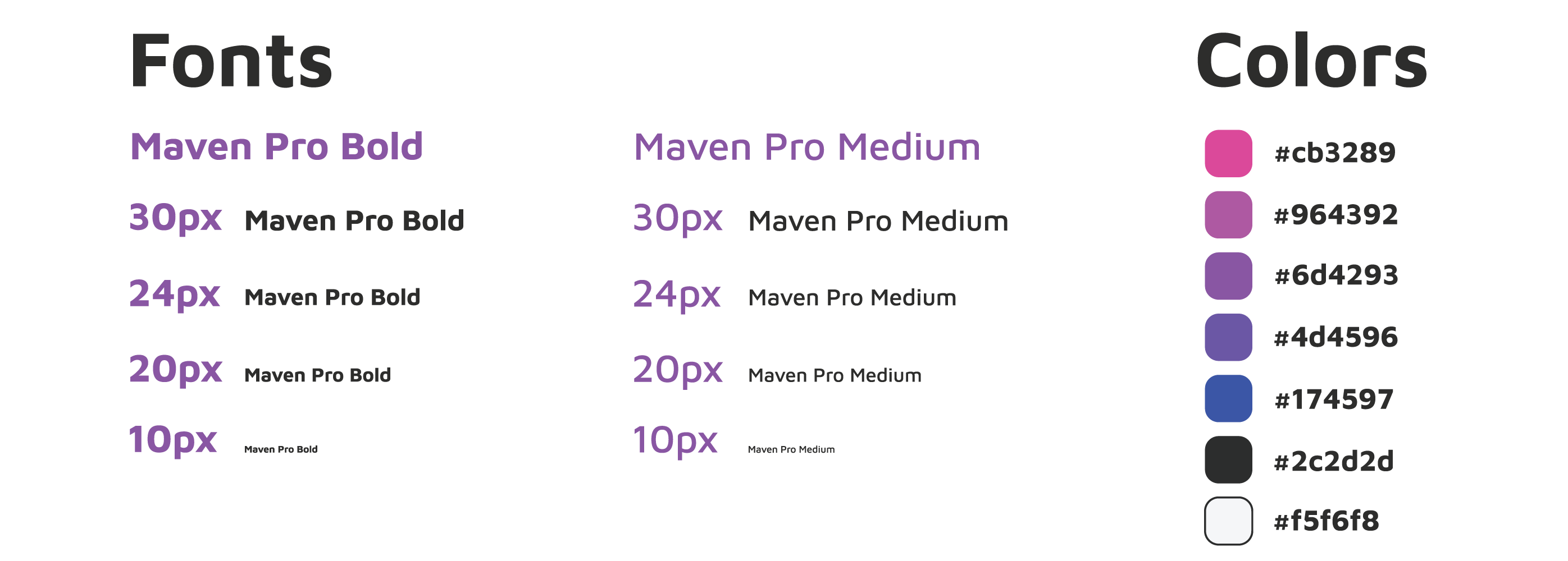
The color palette, the UI elements and the 3D help push this futuristic perception.
And finally, let’s take a look at the users’ journey!
Think about it as the metro, but better.
The user looks for their destination in the app. Then, the app calculates the fastest walking route for the user, leveraging on Blink’s vast network of teleporters.
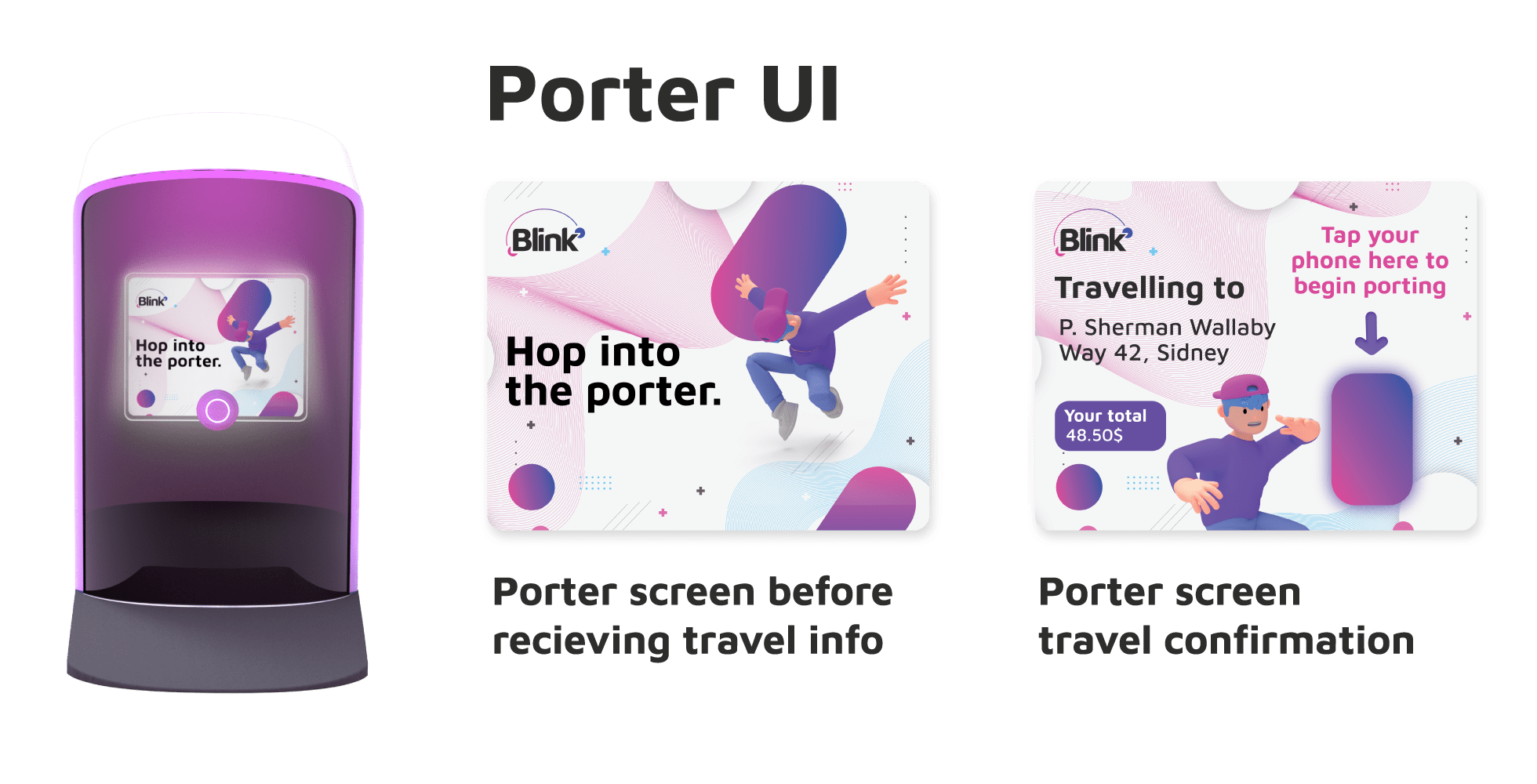
The user follows the given route and upon reaching the porter, taps the porter’s door with their phone. The porter receives the travel information and displays it for the user to confirm.
The user can confirm the travel by tapping their phone on the porter’s screen and then the teleportation begins. (because of the immediacy of teleportation, a double confirmation is safer, to avoid user error and undesired routing mistakes).
Finally, the user is teleported to the porter closest to their destination, and can continue moving on to their destination, saving time and avoiding traffic all at once.


That’s it! thanks for checking it out.
I hope you liked Blink as much as I did. It was such a fun, intense experience to develop this crazy idea in a little over a week. It helped me test my UX & UI skills (and a little bit of my patience as well) 😜, as well as some 3D rendering which I love.
Drop a line and let me know what you think worked best!
you can also head back home and check some of my other projects.
